HTML5, CSS3, and the Great CSS-Off
A while back I entered the Great CSS-Off over at CSS-Tricks. You can find my file here. I used the contest as an excuse to play with html5, css3, and using only semantically meaningful markup. It was an interesting experience, and I'd like to share some of the things I discovered.
HTML5
I found myself wanting a <content> element to match <header> and <footer>. I've found this on several other projects I've messed about with html5 on, too. I've since been told that "everything that isn't in <header> or <footer> tags is content, so you don't need it," but
- It's a useful styling wrapper to prevent a lot of redundant css (and ok, maybe css isn't a very good reason to include markup if you're going semantic)
- It feels really semantically inappropriate to put all my <p>, <img>, etc. tags at the same tree-level as <header> and <footer>. They are not the same level of content. I guess I could use <section>, but it still feels like section should be something that goes inside <header>, <footer>, and <content>.
I also discovered that I don't really understand <hgroup>. Can/should I put it around my headers if there's only one? What if there's a possibility that I might add/remove headers later? What's up with this "document outline" thing, how do I preview it to see if it's doing what I meant? Can I use it for markup?
It also seems like html5 and microformats don't naturally coexist very nicely, but I guess they're working on that.
CSS(3)
There are a lot of cool new things in css3, and it really can be used to substantially reduce markup (no more decorative rounded corner caps, woo!), especially when combined with things like :before and :after. Border images are awesome, and I really love the button styles I was able to get with a combination of border-radius, background gradients, and box-shadow:
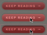
/* css to create the above buttons; text styles and -moz and -webkit prefix versions removed for space */
.more, .more:visited {
    line-height: 25px;
    color: #e97e7e;
    border: 1px solid #88706c;
    padding: 0 13px;
    border-radius: 13px;
    box-shadow: 0 0 3px rgba(0, 0, 0, .5);
    background-color: rgb(110, 38, 38);
    background-image: -moz-linear-gradient(#934d4d, #6f2828);
    background-image: -webkit-gradient(linear, 0% 0%, 0% 90%, from(#934d4d), to(#6f2828));
}
.more:hover, .more:focus { /* increase brightness by 10% */
    color: #ffa1a1;
    background-color: rgb(135, 47, 47);
    background-image: -moz-linear-gradient(#ad5c5c, #8a3232);
    background-image: -webkit-gradient(linear, 0% 0%, 0% 90%, from(#ad5c5c), to(#8a3232));
}
.more:active { /* increase saturation by 10% and add an inner shadow */
    color: #e87b7b;
    background-color: rgb(135, 34, 34);
    background-image: -moz-linear-gradient(#944040, #701d1d);
    background-image: -webkit-gradient(linear, 0% 0%, 0% 90%, from(#944040), to(#701d1d));
    box-shadow: 0 0 3px rgba(0, 0, 0, .7), inset 0 3px 3px rgba(0, 0, 0, .5);
}
However, despite all the new developments I still ran into a lot of limitations that it really seems like css should have overcome by now.
Text pseudoclasses: first n words, nth line, etc.
The mockup for the contest had the first three words of each paragraph bolded. This seemed like a purely stylistic, not semantic, boldening, but all css gives you is first-line and what I needed was first-n-words. Similarly, there were quotations at the bottom that had 3 lines each, each with a different color. Again, purely stylistic, not semantic, so I didn't want to add markup, but how do you get 3 different colors when all you have is first-line? I ended up using javascript for both of those, and the second one ended up being a pretty seriously ugly hack.
It's been pointed out to me that these are pseudoelements, not pseudoclasses. To this I reply that I do not want to have to care. I would like to be able to do anything I can do with one with the other ("p:first-line a", anyone?), and I don't want to have to remember (or constantly look up) which one has the stupid new double colon notation.
Flexible floated image placement
Magazines layouts float images to an arbitrary position up or down from where they naturally fit in the text all the time, but it requires a bit of a hack to do it for the web, and even then you can only do downward. And while we're talking about how magazines use floats that aren't possible on the web, how about floating between columns or floating around an arbitrary shape?
:before and :after
I tried to avoid adding any purely decorative elements to the html, and added them with :before and :after. But there comes a point when that gets difficult, since you can only add one thing for each of those. I started out using :before to get a decorative page fold image to show up at the top left of the main article, but I also needed to use that to get the element that pushes down the image for the afore-mentioned image float hack. I got around it by using multiple backgrounds for the browsers that support it and javascript for those that don't, but I really wished it were possible to have multiple :before elements. I was also frustrated by the inability to apply certain css to things included in this way (e.g. width and height for images), and by the ugliness of things like 'content: "\2192"' (that inserts a right arrow, can't you tell?).
Sure, I could just avoid all that by using javascript in all cases, but I prefer to leave the one-off things like this out of my javascript and keep it with the rest of the style of the element it applies to wherever possible. Or maybe I'm just justifying an underlying discomfort in applying styles with javascript that's becoming less appropriate these days.
Webkit developers don't pay enough attention to detail
I'll forgive them for the new stuff--it's not standard, it's not finished, and it's got a big "-webkit-" red flag on it to say "use with caution." But floats are CSS1, so by now I expect better than the following:

There should not be text on top of that floated image! I think this is related to the float hack mentioned above. There is a 1px wide div shoving the figure down to the appropriate position. I think maybe Webkit is only checking alignment at the top of the line, which is aligned with the 1px div correctly, but the bottom crosses into the second, wider floated element. All other browsers that honor the 1px pusher div seem to check the whole height of the text line.
I also keep running into trouble with new properties being incompletely or incorrectly implemented. I understand that they're new, not yet fully standardized, and not yet finished, but it does highlight a different development ideology from other browsers, which I find interesting. So the couple of things aren't really complaints so much fun quirks I ran across and feel like documenting.
The one I've run into the most different problems with is box-shadow. On previous projects I've hit problems like the property being thrown out if the word "inset" was added to just one of the shadows or the shadow having a thin line of background between it and box it surrounded. This time everything was much nicer, but I did notice the following on the inset button described above:
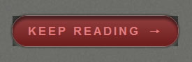
There's an inner shadow to show that the button is depressed, but in Chrome the shadow doesn't get clipped to the rounded button edge. Safari just ignores the "inset" part of the shadow rule but now keeps the rest.
Another interesting thing I ran across, but fortunately pretty easy to get around in this case, was borders and rgba colors. It seems that Webkit overlays the colors of both sides at the corners, which isn't noticeable when they're all solid and the same color, but can lead to dark squares with rgba:
To get around it here, I ended up switching from using borders to using an rgba background color, which then allowed me to get the extra highlight details at the top and left using borders instead of box-shadow as originally planned. (Isn't it cool how flexible css can be?)
All these cool features make me want more cool features!
Apparently I can never be satisfied. Two big things I want, in addition to the things mentioned above that it seems like css should already have, are blending modes (e.g. multiply, overlay, etc. that you can do in Photoshop and other image editors) and alpha masks. And of course it would be great if some of the new things had more flexibility, like letting me change the box shadow gradient curve from solid to transparent independently of total alpha and spread, or allowing gradients along a specified path in addition to radial and linear.
Edit: Apparently WebKit does masks, awesome!
Conclusion
All in all this was a great learning experience for me, getting to know the new elements and styles. I've since thought of other new things I could have added, like the flexible box model. I guess I'll have to think of another project for those.
I griped about Webkit above, but really the support for CSS3 and HTML5 is pretty good in the browsers that support it at all, with more to come in Opera soon and potentially even IE9.
I still wouldn't use HTML5, at least, for any real projects--check out the page in IE with javascript turned off, ick! But progressive enhancement with CSS3 rounded corners, box shadow, RGBA, etc. are definitely on the menu.