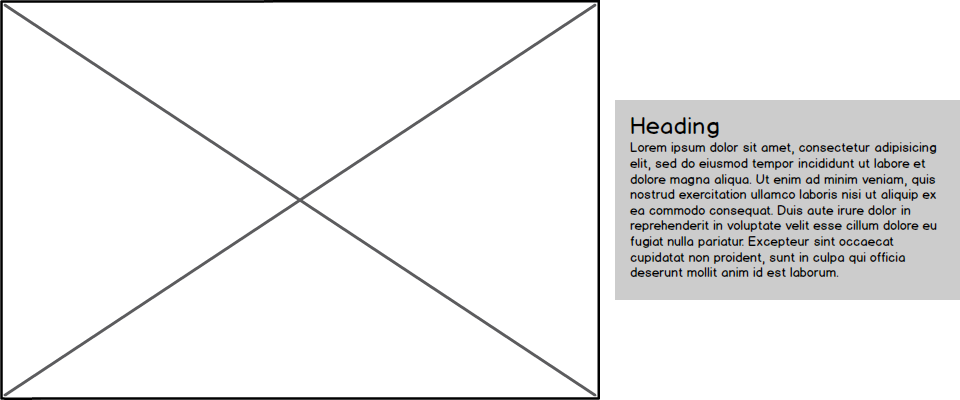
I was recently in a position where I had to build a responsive design that had an image on the left of some text that was centered vertically in the image:
But the small-screen version had the image below the text:
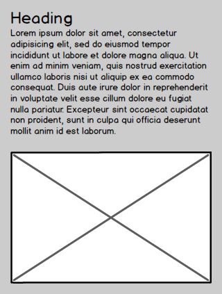
Since the design was responsive, not a separate mobile site, I could either write the html so the image was before or after the text, but I couldn't have both. It's a lot easier to adjust things to the left or the right than it is to change whether they appear before or after something, so I ended up with the image after the text in the html:
<div class="wrapper">
  <div class="content">
  <h1>Heading</h1>
  <p>In good time, the Town-Ho reached her port—a savage, solitary place—where no civilized creature resided. There, headed by the Lakeman, all but five or six of the foremastmen deliberately deserted among the palms; eventually, as it turned out, seizing a large double war-canoe of the savages, and setting sail for some other harbor.</p>
  </div><!-- ((this is how I deal with whitespace between inline block elements))
  --><img src="kitten.jpg" class="image" />
</div>
The small-screen version with the text above the image doesn't need any adjustment, but how to get the image both on the left of the text and have the text vertically centered with the image? The new flexbox properties can do it handily, but until I stop supporting IE 9 and below it won't help me. Float:left can get it to the left but we won't be able to center vertically, inline-block can give us vertical centering but the image will appear on the right because it comes after the text in the source--or will it?
The reason the image appears on the right when both the content and image blocks are set to inline-block is that the text direction is left to right, but we can change that! If we set direction:rtl on the parent of both the image and text blocks, the first inline-block element will appear on the right. Of course, the text is still English, so the direction will have to be set back to left to right on the child elements:
.wrapper {
  direction: rtl;
}
.content {
  display: inline-block;
  vertical-align: middle;
  width: 30%;
  direction: ltr;
  text-align: left;
}
.image {
  display: inline-block;
  vertical-align: middle;
  width: 65%;
  direction: ltr;
}
This method appears to work everywhere I've tested that supports inline-block (in IE 6 and 7 it's best to just float the image and forget about vertical alignment). Opera does have a bug if you try to give the content element a left margin--the margin ends up at the left of the image instead of between them. Newer versions of Opera probably won't have that problem with the transition to Webkit, but if you need to support devices with embedded Opera and no browser updates it could be a concern.
Here's a demo, including some more complicated padding and margin:
(Unfortunately the popup isn't resizeable at the moment, you can open it up in a new tab if you want to see it switch over to the vertical design.)
Bonus links
I look forward to flexbox being ubiquitous so I can stop relying on silly tricks like this, but in the meantime here are some nice tutorials on it so we can all get excited about it together:
Understanding the CSS3 Flexbox
Using Flexbox: Mixing Old and New for the Best Browser Support
